目次
警告用のカスタムモーダルダイアログ
customAlert():この関数は、標準の alert() 関数のカスタマイズ版です。メッセージを表示し、ユーザーがOKボタンをクリックするまで処理を中断します。ただし、デザインやアニメーションをカスタマイズできるようになっています。
サンプルコードを表示
<!DOCTYPE html>
<html lang="ja">

<head>
    <meta charset="UTF-8">
    <title>カスタムモーダルダイアログ</title>
    <style>
        .modal {
            display: none;
            position: fixed;
            z-index: 1;
            left: 0;
            top: 0;
            width: 100%;
            height: 100%;
            overflow: auto;
            background-color: rgba(0, 0, 0, 0.5);
        }

        .modal-content {
            background-color: #fefefe;
            margin: 15% auto;
            padding: 20px;
            border: 1px solid #888;
            width: 80%;
            max-width: 300px;
        }

        .modal-button {
            width: 100%;
            padding: 10px 0;
            margin-top: 10px;
            background-color: #55abff;
            color: #ffffff;
            cursor: pointer;
        }

        .modal-input {
            width: 100%;
            padding: 5px;
            box-sizing: border-box;
        }
    </style>
    <script>
        function openModal(modalId) {
            document.getElementById(modalId).style.display = 'block';
        }

        function closeModal(modalId) {
            document.getElementById(modalId).style.display = 'none';
        }

        function customAlert() {
            openModal('alertModal');
        }
    </script>
</head>

<body>
    <button onclick="customAlert()">Custom Alert</button>

    <div class="modal" id="alertModal">
        <div class="modal-content">
            <p>This is a custom alert.</p>
            <button class="modal-button" onclick="closeModal('alertModal')">OK</button>
        </div>
    </div>
</body>

</html>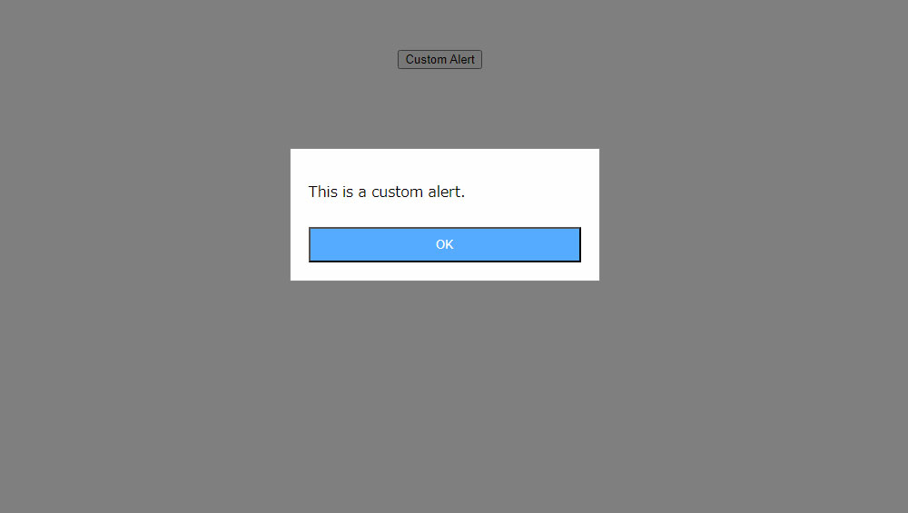
確認ボタン付きのカスタムモーダルダイアログ
customConfirm(): この関数は、標準の confirm() 関数のカスタマイズ版です。メッセージとOK/キャンセルボタンを表示し、ユーザーの選択に応じて真偽値を返します。デザインやアニメーションをカスタマイズできます。
サンプルコードを表示
<!DOCTYPE html>
<html lang="ja">

<head>
    <meta charset="UTF-8">
    <title>カスタムモーダルダイアログ</title>
    <style>
        .modal {
            display: none;
            position: fixed;
            z-index: 1;
            left: 0;
            top: 0;
            width: 100%;
            height: 100%;
            overflow: auto;
            background-color: rgba(0, 0, 0, 0.5);
        }

        .modal-content {
            background-color: #fefefe;
            margin: 15% auto;
            padding: 20px;
            border: 1px solid #888;
            width: 80%;
            max-width: 300px;
        }

        .modal-button {
            width: 100%;
            padding: 10px 0;
            margin-top: 10px;
            background-color: #55abff;
            color: #ffffff;
            cursor: pointer;
        }

        .modal-input {
            width: 100%;
            padding: 5px;
            box-sizing: border-box;
        }
    </style>
    <script>
        function openModal(modalId) {
            document.getElementById(modalId).style.display = 'block';
        }

        function closeModal(modalId) {
            document.getElementById(modalId).style.display = 'none';
        }


        function customConfirm() {
            openModal('confirmModal');
        }

        function confirmAction() {
            // ここに確認ボタンを押した後の処理を記述
            closeModal('confirmModal');
        }

    </script>
</head>

<body>
    <button onclick="customConfirm()">Custom Confirm</button>

    <div class="modal" id="confirmModal">
        <div class="modal-content">
            <p>Are you sure you want to continue?</p>
            <button class="modal-button" onclick="confirmAction()">Yes</button>
            <button class="modal-button" onclick="closeModal('confirmModal')">No</button>
        </div>
    </div>
</body>

</html>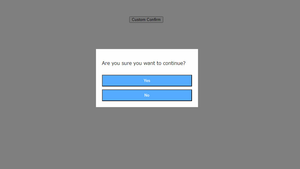
入力フィールド付きのカスタムモーダルダイアログ
customPrompt(): この関数は、標準の prompt() 関数のカスタマイズ版です。メッセージと入力フィールドを表示し、ユーザーが入力した値を返します。デザインやアニメーションをカスタマイズできます。
サンプルでは、イベントが発生したときに、イベントのタイプを取得し、それをコンソールに表示します。
サンプルコードを表示
<!DOCTYPE html>
<html lang="ja">

<head>
    <meta charset="UTF-8">
    <title>カスタムモーダルダイアログ</title>
    <style>
        .modal {
            display: none;
            position: fixed;
            z-index: 1;
            left: 0;
            top: 0;
            width: 100%;
            height: 100%;
            overflow: auto;
            background-color: rgba(0, 0, 0, 0.5);
        }

        .modal-content {
            background-color: #fefefe;
            margin: 15% auto;
            padding: 20px;
            border: 1px solid #888;
            width: 80%;
            max-width: 300px;
        }

        .modal-button {
            width: 100%;
            padding: 10px 0;
            margin-top: 10px;
            background-color: #55abff;
            color: #ffffff;
            cursor: pointer;
        }

        .modal-input {
            width: 100%;
            padding: 5px;
            box-sizing: border-box;
        }
    </style>
    <script>
        function openModal(modalId) {
            document.getElementById(modalId).style.display = 'block';
        }

        function closeModal(modalId) {
            document.getElementById(modalId).style.display = 'none';
        }

        function customPrompt() {
            openModal('promptModal');
        }

        function promptAction() {
            const inputValue = document.getElementById('promptInput').value;
            // ここにプロンプトの入力値を使用した処理を記述
            closeModal('promptModal');
        }
    </script>
</head>

<body>
    <button onclick="customPrompt()">Custom Prompt</button>

    <div class="modal" id="promptModal">
        <div class="modal-content">
            <p>Please enter your name:</p>
            <input type="text" id="promptInput" class="modal-input">
            <button class="modal-button" onclick="promptAction()">Submit</button>
            <button class="modal-button" onclick="closeModal('promptModal')">Cancel</button>
        </div>
    </div>
</body>

</html>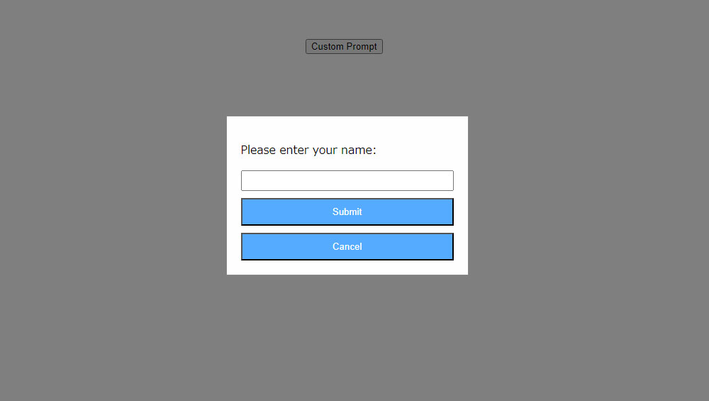
これらのカスタム関数は、通常、外部ライブラリやフレームワークを使用して実装されます。
例えば、SweetAlert2やBootstrapのモーダルなど、多くのUIライブラリがカスタムアラート、確認、プロンプトダイアログを提供しています。これらのライブラリを使用することで、開発者は独自のデザインや挙動を持つダイアログを簡単に実装できます。